Have an idea for an infographic but don’t know where to begin with designing it?
Fear not!
With thanks to Lyndon, we’ve compiled an ultimate design resource for every imaginable type of infographic. Well, nearly every one.
Our blog post earlier this year, identified the 8 different types of infographics.
This is a list of 50 that we think deserve to be noted for their design, or certain aspects of them.
A visual list of infographic inspiration awaits…
The Visual Article
The Visual Article infographic is all about attracting the viewer immediately with the title and offering something more than just a written article. The content itself must be varied, interesting and plentiful so that readers do not come away disappointed.
1. Amsterdam: On Yer Bike – by easyJet Holidays

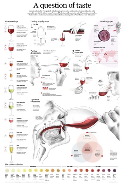
2. A question of taste – by South China Morning Post
3. 50 Unbelievable Facts about Earth – by Giraffe

4. 50 Incredible Facts about Skin – by beautyflash

5. Why Bill Gates is Better than Batman – by Frugal Dad

6. 50 Insane Facts about Hair – by Hair Loss Geeks

Source
7. How to Control Your Dreams – by BedroomWorld

Source
The Flow Chart
Flow charts are successful for answering questions and when engaging the right audience do well on social media. The design of a flowchart prefers simple over cluttered and to make it worthwhile, there needs to be plenty of options so the viewer doesn’t feel forced into an overly narrow category. Tongue-in-cheek is common and a sense of humour is definitely a bonus!
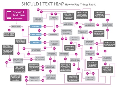
8. Should I Text Him? – by Becca Classon
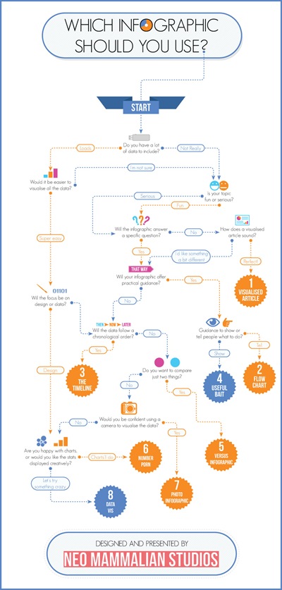
9. Which Infographic Should You Use? – by NeoMam Studios
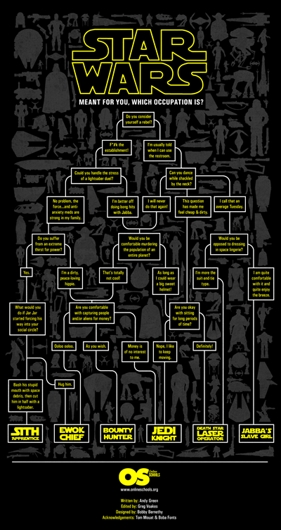
10. Star Wars Occupation Flowchart – by OnlineSchools
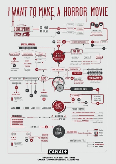
11. I Want to Make a Horror Movie – by Canal+
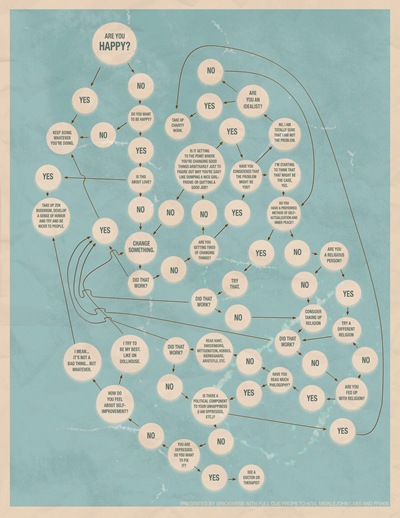
12. Are You Happy? – by Rick Webb
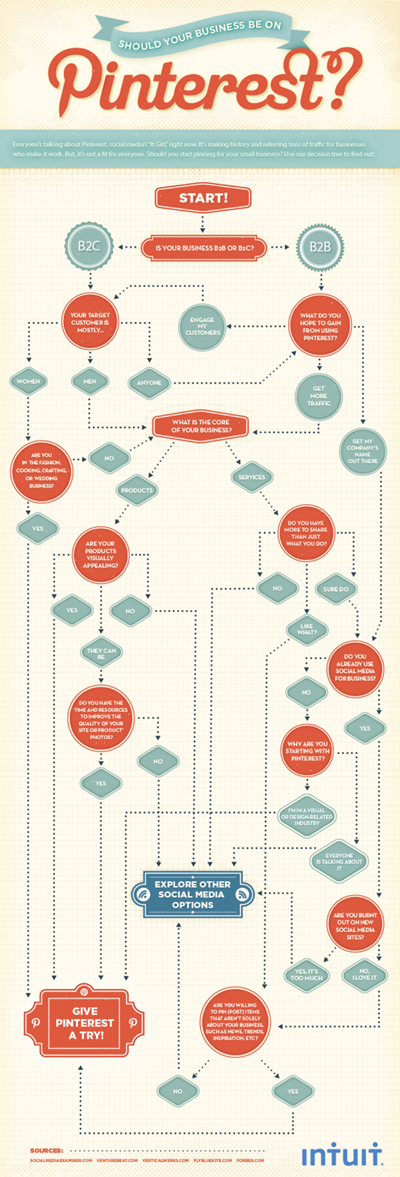
13. Should Your Business be on Pinterest? – by Intuit
Useful Bait
The useful bait does what it says and provides a useful resource to the viewer. Usability should be the priority with a straightforward design and content which is strictly relevant to the topic. When designing infographics like these it’s best to imagine them being printed out.
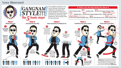
14. Gangnam Style The 5 Basic Steps – by Hugo A Sanchez
15. Kitchen Cheat Sheet – by Everest

16. Sitting is Killing You – by Medical Billing & Coding

Source
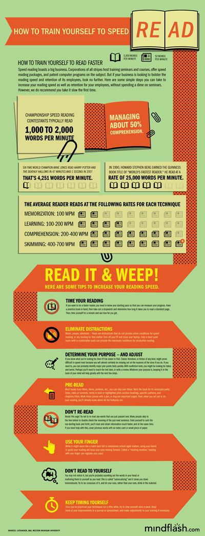
17. How to Train Yourself to Speed Read – by Mindflash
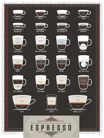
18. Exceptional Expressions of Espresso – by Pop Chart Lab
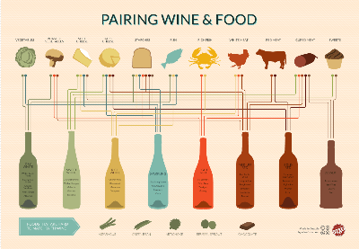
19. Pairing Wine & Food – by Wine Folly
20. The Shelf Life of Food – by Visual.ly

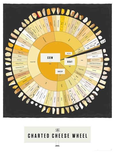
21. The Charted Cheese Wheel – by Pop Chart Lab
Number Porn
Impressive numbers coupled with an engaging design make the ‘Number Porn’ infographic work. Numerical infographics boil down to a lot of numbers with little visualisation to aid comprehension. They are straightforward to produce but may lack a bit of imagination.
22. Titanic by the Numbers – by History.com

23. Education by the Numbers – by Microsoft Education
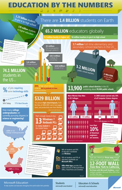
24. A Day in the Internet – by MBA Online

25. Google: Behind the Numbers – by Business MBA

The Timeline
The timeline shows a journey to the viewer and it must be important to them to be successful. Each element of a timeline infographic should be visualised, so it’s easy to see the progression and is visually stimulating.
26. The Road of the Future – by Carloan4u

Source
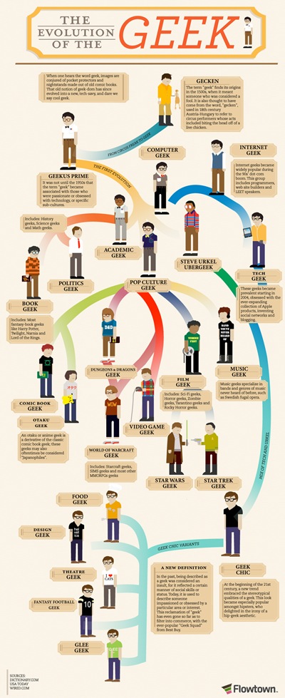
27. The Evolution of the Geek – by Flowtown
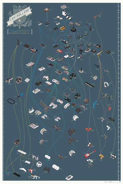
28. The Evolution of Video Game Controllers – by Pop Chart Labs
29. A History of Western Typefaces – by Mashable

30. The History of Home Heating – by Global Home Improvements

Source
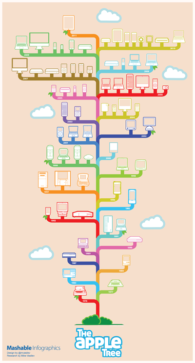
31. The Apple Tree – by Mashable
Data Visualisation
“If a picture is worth a thousand words, then a data visualization is worth a thousand more.”
Data Visualisation is the bread and butter of the infographic world. A creative approach along with careful design can get great results and lead to placement on high-profile sites.
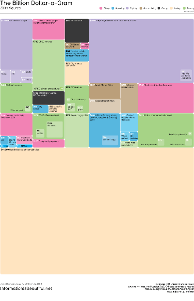
32. The Billion Dollar-o-Gram – by David McCandless
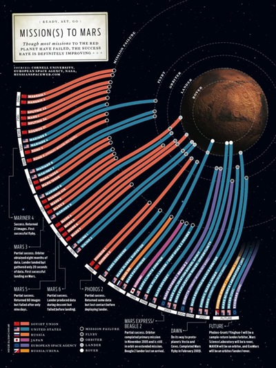
33. Mission(s) to Mars – by Bryan Christie Design
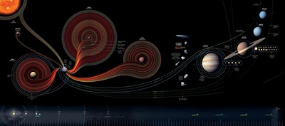
34. Fifty Years of Exploration – by National Geographic
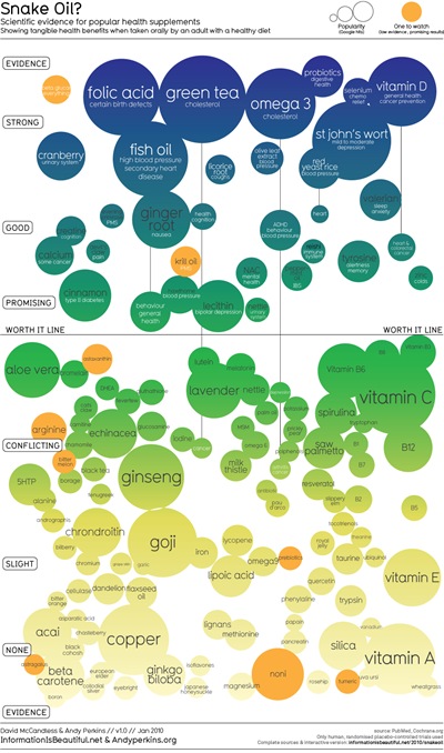
35. Snake Oil? by David McCandless
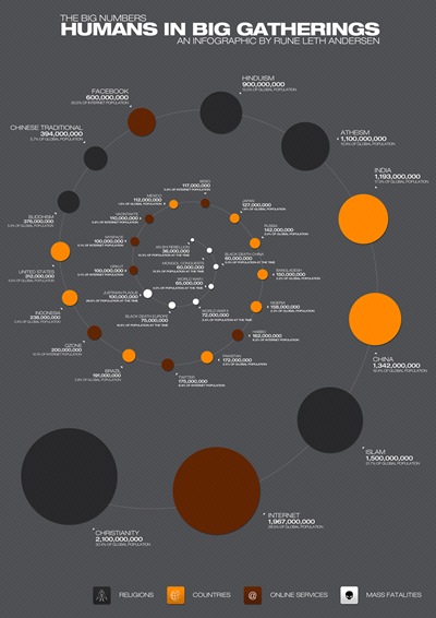
36. The Big Numbers – by Rune Leth Anderson
The Versus Infographic
Matching content to audience is crucial here. You need to consider what the audience care about and focus on two characters or concepts. A common feature of these infographics compares both differences and similarities. A little humour and stylised design are a must if they are to succeed.
37. Geek vs Hipster – by Geeks Are Sexy

38. Messi vs Ronaldo – by Visual.ly

39. A Tale of Two Meals – by Massive Health

40. Beef versus Horse – Guardian Digital Agency

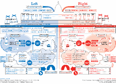
41. How Being a Liberal or Conservative Shapes Your Life – by David McCandless
42. Serif vs Sans – The Final Battle – by Urban Fonts

43. Woof vs Meow – What Our Furry Pets Reveal About Us – by Hunch

The Photo Infographic
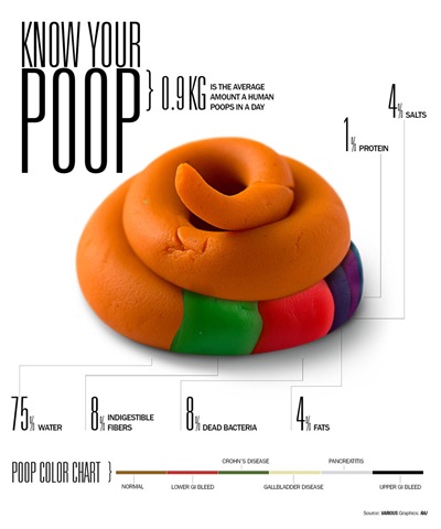
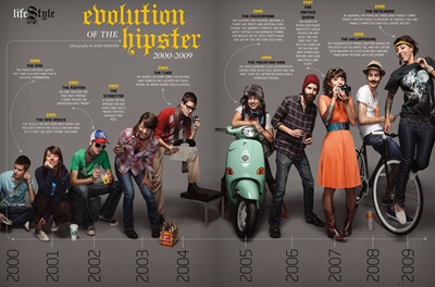
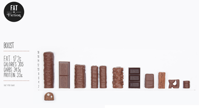
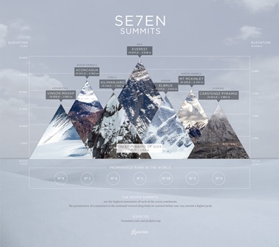
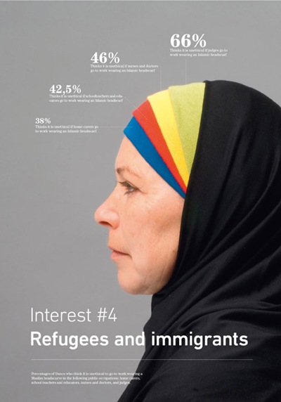
Arguably the hardest to produce, these infographics need quality photographs and a well thought out design to come off as professional looking. When done right though, these infographics are visually arresting and provide a unique way to display information.
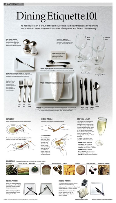
44. Dining Etiquette 101 – by Sun Sentinel
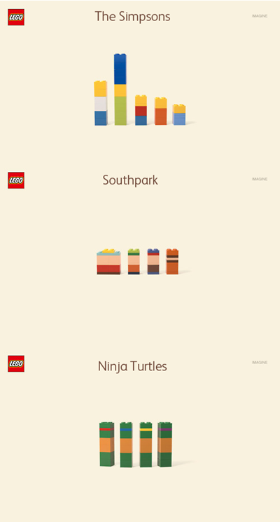
45. The Simpsons, South Park and Ninja Turtles LEGOs – by Jung Von Matt
46. Know Your Poop – by Raj Kamal
47. The Evolution of a Hipster – by Paste Magazine
48. Fat or Fiction – by Fat or Fiction
49. Seven Summits – by FFunction
50. Refugees and Immigrants – by Peter Orntoft
We hope these proved useful and let us know if you agree with our choices!
Compiled by Danny Ashton, founder of the infographic agency NeoMam Studios.